Somewhere between "empty shelf" and "shelf that looks like a magazine spread" is a gap most people never close, and it's not a money problem. You don't need a $400 styling consult or a truckload of pottery-barn ceramics. You need a handful of small, cheap objects that do specific jobs — weight, height, containment, contrast — and about twenty minutes of actually rearranging what you already own. This isn't a guide to bookshelves themselves; if yours is sagging or too small, that's its own article. This is about what goes on the shelf once the shelf itself is fine: the bookends, trays, small plants, and little sculptural objects that turn a wall of spines into something you'd actually photograph.
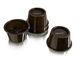
- Top pickSlipstick CB645 3-Inch Furniture Risers (4-Pack)~$20
- Best budgetOXO Good Grips POP Container, 3.4 Qt~$16
- Worth the splurgeOXO Good Grips 4-Piece Interlocking Drawer Organizer~$30
Why most bookshelves look cluttered instead of curated
The difference between a shelf that reads as "styled" and one that reads as "storage" almost never comes down to how expensive anything on it is. It comes down to three things: uniform height, uniform density, and no negative space. A shelf where every book stands upright, spine-out, packed edge to edge with nothing else on it, reads as a library card catalog — organized, sure, but visually flat. Your eye has nowhere to land, because nothing on the shelf is doing anything different from anything else.
Styling a shelf is really just introducing variation on purpose: some books stacked flat, some standing, small objects breaking up long runs of spines, empty air left on purpose instead of filled out of habit. None of that requires new furniture. It requires taking maybe a third of what's currently jammed onto the shelf, setting it aside, and being more deliberate about what goes back.
The actual rule for arranging a shelf: work in threes, not evenly
If you take away one rule from this whole article, make it this one: group in odd numbers, not even ones. Three objects clustered together reads as an intentional vignette. Two objects reads as a matched pair (fine occasionally, but boring everywhere). Four objects spaced evenly reads as a display case at a dentist's office. Designers call this triangulation — vary the height of the three objects (tall, medium, short) so your eye moves through the grouping instead of skimming across a flat line.
The other habit worth building: stop distributing books and objects evenly across every shelf. A bookshelf styled well usually has one or two shelves that are dense with books, and one or two that are intentionally lighter — a run of books bookended by an object, then genuine empty space, then maybe a small stack. Even distribution is what an untouched shelf looks like. Uneven, breathing-room distribution is what a styled one looks like.
Vertical vs. horizontal stacking — and when to use each
Books standing upright, spines facing out, are the default and they're fine — but a shelf that's 100% vertical spines, shelf after shelf, is the single most common reason a bookcase looks like storage instead of decor. The fix is mixing in horizontal stacks, and there's a simple logic to when each works. Standing books work for a run you actually reference or reread — a cookbook shelf, a set of novels you're proud of, anything you want legible by title. Horizontal stacks work anywhere you want to break a long vertical run, add a flat surface to set an object on top of, or hide a set of book spines that don't match your color scheme.
A stack of three to five books, laid flat, with a small object on top — a bookend turned into a paperweight, a small dish, a piece of stone — is one of the single most reliable styling moves that exists. It does three things at once: it breaks the vertical rhythm, it adds a flat display surface where you didn't have one, and it lets you literally hide a book's ugly cover by laying it face-down or spine-in.
Bookends that actually earn their spot
A lot of bookend shopping goes wrong because people buy bookends only for the shelves that are already full enough to need them. The better use of a bookend is on a shelf that's not full — using a solid, weighted pair to prop up a shorter run of eight or ten books instead of letting them flop sideways into empty space. That's the actual engineering job a bookend does. The styling job is secondary: a good pair, in a material that contrasts with your shelf (matte black metal against light wood, for instance), reads as a deliberate design choice instead of a prop holding books up.
Skip the novelty bookends — the ones shaped like animals or cartoon characters that only work in a kid's room. For a shelf you actually want to look put-together, plain geometric shapes in metal, stone, or wood outlast every trend and never clash with whatever else you add to the shelf later.
Trays, small boxes, and containing the chaos
Every real bookshelf accumulates loose stuff — a spare phone charger, a candle, a set of keys, a stray receipt. Left loose, that stuff is what makes a shelf look messy no matter how nicely the books are arranged, because your eye reads clutter as clutter regardless of what's underneath it. The fix isn't hiding it elsewhere. It's containing it in one visually intentional object instead of letting it scatter across the shelf as five separate small things.
A shallow tray or divided organizer does this well because it turns "five random objects" into "one object with five things inside it" — visually, that's a completely different read, even though nothing about the actual clutter changed.
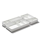
For the shelf near an entryway or a desk — the one that tends to catch mail, spare change, and a half-used pack of gum — a small lidded container does the same job but with the option to close the lid entirely and hide the contents, which matters more the closer the shelf sits to a place guests actually stand.

Plants, coasters, and the organic accents that finish it
Books and boxes are both hard-edged, matte, and mostly rectangular. What a styled shelf needs next is something with a different texture — something organic, something with a curve, something that isn't a rectangle. This is where a small plant, a stone coaster, or a little vase earns its keep: it's the one element on the shelf that isn't trying to be tidy, and that contrast is what keeps the whole arrangement from looking like a spreadsheet.
A real plant is lovely if your shelf gets any indirect light and you'll actually remember to water something two feet above eye level (be honest with yourself here). If not, a decent faux plant does the same visual job with zero maintenance, and shelf-scale faux greenery has gotten good enough that from a normal viewing distance nobody's checking.
Coasters get overlooked as shelf decor, but a small stack of two or three stone or marble coasters, propped or laid flat, is a genuinely good stand-in for a "sculptural object" if you don't want to buy an actual sculpture. Lean one against a stack of books like a tiny piece of art, or set a small faux plant on top of the stack for another round of height variation.
If you want a real sculptural piece instead of repurposing something else, keep the same rule from earlier: odd numbers, varied height, and pick one material family (all matte black, all natural wood, all pale stone) rather than mixing five different finishes on one shelf. A single small object in the same finish as your bookends does more for the "this was designed on purpose" feeling than five mismatched trinkets ever will.
What to skip
A few categories of shelf decor reliably make a bookcase look worse, not better, no matter how nice each individual piece is. Skip anything genuinely fragile sitting at a height kids or pets can reach — a knocked-over vase is not a styling risk worth taking on a low or mid-height shelf in a house with either. Skip oversized objects that dwarf the books around them; a single 12-inch sculpture on a shelf otherwise full of paperbacks looks like it wandered in from a different room, not like a deliberate accent. Skip picture frames with photos angled to catch glare from a nearby window — you'll notice the glare in every photo of the room, even if you don't notice it standing in front of the shelf itself. And skip buying everything in one trip from one collection; shelves that use pieces from five different sources over time almost always look more intentional than a matched set bought all at once, because a matched set reads as a kit, not a life.
One more, and it's the biggest one: skip filling every single shelf. A bookcase with one shelf left almost entirely empty, holding just a single object and some breathing room, does more for the whole unit than any individual purchase on this list. Restraint is a styling choice too, and it's the free one.
Frequently asked questions
Do I need to buy new bookends, or can I use what I have?
Use what you have if it's plain and sturdy — the styling problem is almost never the bookend itself, it's using them on the wrong shelf (a shelf that's already packed tight doesn't need bookends at all) or skipping them on a shelf with a short, loose run of books that actually needs the support. If yours are mismatched or flimsy plastic, that's when it's worth the $15–20 for a heavier, plainer pair.
How many decorative objects is too many on one shelf?
As a rough guide, no more than one grouping of two to three objects per shelf, with the rest of that shelf left to books or open space. Once you're adding a fourth or fifth object to a single shelf, it usually stops reading as curated and starts reading as cluttered again — the same problem you were trying to fix in the first place.
Is it okay to use faux plants instead of real ones on a bookshelf?
Yes, and for shelf height specifically, faux is often the more practical call — watering something above eye level is easy to forget, and a dead or dying plant on display does more visual damage than a good faux one ever would. A decent faux succulent or small stem, viewed at normal shelf distance, reads as real to almost anyone who isn't specifically looking for the tell.
What's the cheapest way to make a bookshelf look styled instead of just full?
Remove roughly a third of what's currently on it. Before buying anything, pull books you're not attached to into a stack elsewhere, lay a few of the remaining ones flat instead of standing every single one upright, and leave real empty space on at least one shelf. That alone — done with zero new purchases — fixes more of the "cluttered, not curated" problem than any single object you could add.
Should decorative objects match my book covers or contrast with them?
Contrast, generally. Matching every object's color to nearby book spines is hard to pull off and reads as try-hard when it doesn't quite land. It's more reliable to pick one or two neutral finishes — matte black, natural wood, pale stone — and let those repeat across your bookends, trays, and small objects while the books themselves provide the color variety.
How do I style a shelf that's mostly paperbacks with mismatched, colorful spines?
Lean into horizontal stacks and turned-in spines more than you would on a shelf of matching hardcovers. Laying a run of mismatched paperbacks flat, stacked three or four high with an object on top, hides the visual noise of clashing spine colors far better than standing them upright ever will. Reserve upright, spine-out shelving for the books whose covers you actually like looking at.